Welcome
Thank you for visiting the Virginia Department of Social Services' (VDSS) Brand Guide resource website. The information included within this guide is designed to ensure visual and tonal consistency of VDSS brand identity elements across all projects, websites, and internal external platforms. These guidelines reflect our agency's commitment to reinforcing an integrated, consistent and cohesive message of who we are. This serves as a resource for all stakeholders who communicate on behalf of VDSS or partner with our agency. Utilizing the resources provided here, all members of our agency, including our trusted partners, are empowered to produce digital resources that reflect the culture, values and point of view of our agency. It is expected that this resource will evolve over time as new needs and priorities arise.
Brand Foundations
At VDSS, we put people at the center of everything we do. We believe that every Virginian can live a life of dignity and that all voices, ideas and experiences contribute greatly to our pursuit of excellence. Our brand guidelines set the standard for how we engage with our customers and underscore our commitment to the delivery of high-quality human services.
Our brand is more than a logo. It's how our customers see us, how we convey our ideas, and how we engage and communicate with our audience. It reflects our agency's commitment to the following core values:
- People First
- Commit To Excellence
- Embrace Differences
- Think Bigger
- Win Together
Naming Guidelines
Virginia Department of Social Services (VDSS)
- Tagline: People Helping People
Mission
To design and deliver high-quality human services that help Virginians achieve safety, independence and overall well-being.
Vision
A Commonwealth in which all Virginians have the resources and services they need to shape strong futures for themselves, their families and their communities.
Telling Our Story
Ensuring a consistent editorial style and tonality helps to support our agency's unique voice and brand identity. In print and digital formats, our messaging should convey a positive, human-centered tonality. Written language should reflect editorial guidelines in accordance with the Associated Press (AP) Stylebook to ensure consistent grammatical, punctuation, formatting, abbreviation and word choice.
Our written and visual communications should also be Hope-centered and anchored in the practice of (1) conveying the mission, vision and values of the agency, (2) fostering willpower within our audiences to achieve a better future for themselves, and (3) illuminating the pathways we provide toward their goals. Ask yourselves: What is our audience's goal? What are the barriers they need to overcome? How can our written and visual communication support the pathway(s) to achieving that goal?
Visual Branding
Resources surrounding visual branding including fonts, colors, logo usage, presentation templates, and imagery.
Logo
The VDSS logo is the foundational visual asset of the agency and represents the relationship between our agency and the citizens that we serve. All publicly facing materials are required to utilize only the VDSS agency logo. Cobranding with other state agencies or community partners is possible with Public Affairs approval. For employees who need to download the VDSS logo or logo resources, you can access them here on the intranet.
Third-party partners looking to request any of our agency's brand assets should work with their VDSS program contact. As a brand ambassador, our staff members are responsible for safeguarding the VDSS brand and should collaborate with the Division of Public Affairs staff, as appropriate, to ensure adherence to our brand standards.
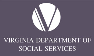
 Color Blue / White Background
 Black / White Background
 Color Blue / Light Tone Background
 Color Blue / Mid-tone Background
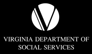
 Reverse / Dark Background
 Reverse / Black Background
Logo & Tagline Lock-up
When our tagline, 'People Helping People,' appears with the agency's primary logo, the two elements together are referred to as the logo and tagline lock-up. The logo lock-up secures both elements into a specific relationship to one another and forms a single unit. The elements may not be rearranged or altered in any way to change the logo's graphic integrity.
Logo Sizing and Positioning
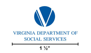 Logo should never be smaller than 1 ½” width or ½”
height.
Logo should never be smaller than 1 ½” width or ½”
height.Proportions must remain consistent.
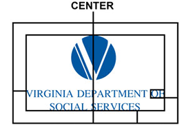 Space bordering logo must be equal to the width and height
of the “OF”.
Space bordering logo must be equal to the width and height
of the “OF”.Space will change proportionally as the size of the logo changes.
 Logo colors: Pantone 7462 C (Blue) Pantone Black
Do not:
- modify the design or color of the logo and associated taglines
- stylize, warp or adjust the proportions of its shape
- use any icons or images to represent the VDSS logo aside from those provided within this guide
- make the VDSS brand the most distinctive or prominent feature
- imply partnership, sponsorship or endorsement by combining it with other entities logos
- depict the brand in a negative light as part of a script or storyline
- remove, add, or change any elements of the logo, including the agency name
- add your organization name to the logo using any treatment aside from those approved within this brand guide
- change the orientation of the logo
- bevel or emboss effects on the logo
- add “glow” effects to the logo
- add a “drop shadow” effect to the logo
- put a white box around the logo when placed on a dark or busy background
- reconfigure or change the size or placement of any logo elements
- recreate or replace elements
- change the logo font
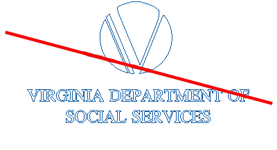
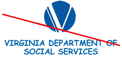
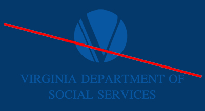
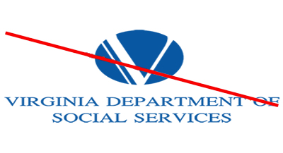
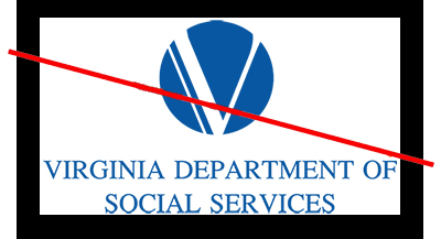
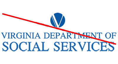
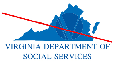
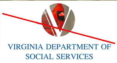
Logo Misuse Examples
Here are some examples on how NOT to use or manipulate the VDSS logo.
Fonts
A font is a set of printable or displayable text characters in a specific style and size. Fonts support the VDSS brand and compliment promotional materials used by the agency for various programs and initiatives. Fonts also assist in maintaining the integrity of the brand and ensure that the text style is presented in a manner consistent with branding standards.
On all digital media and websites, we use Merriweather for headings and Source Sans Pro for body content.
Microsoft Fallbacks
| VDSS Font | Merriweather (8 styles) | The quick brown fox jumps over the lazy dog |
| Microsoft | Calisto MT (4 styles) | The quick brown fox jumps over the lazy dog |
| VDSS Font | Source Sans Pro (12 styles) | The quick brown fox jumps over the lazy dog |
| Microsoft | Calibri (6 styles) | The quick brown fox jumps over the lazy dog |
| Microsoft | Segoe UI (12 styles) | The quick brown fox jumps over the lazy dog |
| VDSS Font | Bebas Neue (1 style) | The quick brown fox jumps over the lazy dog |
| Microsoft | Franklin Gothic Demi Cond (all caps) (is a style) | THE QUICK BROWN FOX JUMPS OVER THE LAZY DOG |
| Microsoft | Impact (1 style) | The quick brown fox jumps over the lazy dog |
| Microsoft | Fira Sans bold (all caps) | The quick brown fox jumps over the lazy dog |
Print and Digital Media
For print and digital media, you may need to download and install fonts on your computer. All agency approved fonts are preinstalled on most computers. If the approved fonts are not accessible on your computer, you may download them from Google Fonts. For information regarding the installation of fonts, please review appropriate guidance or contact your PC support provider:
Websites
Fonts used on websites should be added to using Google Fonts or by a CSS include method. Arial should be used as a fallback for browsers that are unable to present the desired font. This can be addressed within the CSS code as displayed below:
font-family: 'Source Sans Pro', Arial, sans-serif;
Colors
The following are the official brand colors for VDSS. The Primary Palette should be used for at least 70% of the visual design elements. The Secondary Palette should be used for at most 30% of visual design elements.
Primary Palette
Secondary Palette
*Note: Do not use these colors for light, thin and small text, only use them for headings (preferably on dark backgrounds such as VDSS Dark Gray, VDSS Purple, VDSS Blue or black).
We recommend developers use WAVE (by WebAIM) to check the accessibility and contrast of their site content.
Imagery Guidance
VDSS imagery should be positive, professional and representative of the diverse citizens served by the agency. Visuals should exhibit partnership, service and diversity without regard to race, religion, national origin, citizenship status, sex, gender identity, sexual orientation, age or disability. Imagery should be warm in color and bright in tonality. Images that may inadvertently promote stereotypes should be avoided.
All imagery will be selected from Adobe Stock, GettyImages or internally taken photos. An image repository can be found on Fusion. Images from Adobe Stock or GettyImages can be requested from the Public Affairs division by emailing webdev@dss.virginia.gov. Detailed instruction for doing so can be found here. Use of photos containing public citizens or non-staff members requires the Story and Photograph Release form found here.
Stock imagery portraying professional and realistic scenarios should be used in all print and digital collateral. Illustrations should be avoided and utilized on a limited basis for such purposes as infographics or other storytelling objectives. The Public Affairs Division should be consulted on the appropriate use of illustrations.
Web Guidelines
To ensure a unified web presence, it is expected that all VDSS-branded websites will adhere to the web standards and styles outlined within this Brand Guide to help reinforce the VDSS brand identity.
Header & Footer Requirements
Each VDSS website, subsite, and microsite shares the same header and footer. The header includes a link back to the VDSS public website on the left hand side and a link to the Commonwealth of Virginia on the right side. The footer includes a link back to the VDSS public site as well as a copyright notice and privacy policy.
In accordance with VITA web accessibility requirements, the VDSS footer will also display a Google Translate selector on the side of the browser to allow users to translate the page into another language.
View the instructions and resources for the VITA header here and download the include files for the VDSS footer here.


Mobile Requirements
All VDSS websites are required to be mobile responsive, displaying the content and design properly on all devices. Mobile websites will need to retain the VITA banner and VDSS footer for consistency with the desktop experience. Native mobile applications (i.e. applications downloaded from the Apple App Store or Google Play Store) are required to display the VDSS logo, copyright information, as well as the privacy policy.
Copyright
A copyright must be included in the footer of the application indicating the current year. Following the HTML copyright symbol (©) should be the year and "Virginia Department of Social Services" which links to the main public site. If a partner organization assisted in the development of the site, their agency can be included preceding the VDSS text.
Privacy Policy
A link to the VDSS Privacy Policy link must be included under the copyright line which links to the VDSS Privacy Policy page on the main public site.
Accessibility
“Accessibility” refers to the design of products, devices, services, and environments for people who experience different types of disabilities. It is essential that several different components of web development and interaction work together in order for the web to be accessible to people with disabilities.
Our goal is to ensure our ecosystem of products meets criteria in the Web Content Accessibility Guidelines 2.0.
Accessibility is based on four principles: perceivable, operable, understandable, and robust. Keep these principles in mind when developing content as well as creating assets.
Perceivable:
- Content:
- Make sure all videos have captions.
- Include meaningful alt text for images, icons, and controls.
- Do not use images to display text, unless the text is a component of a graphical elements, such as a logo.
- When a label is used multiple times on the same screen (Edit, Learn, more), provide screen-reader-only text to clarify.
- Don't refer to color, or where elements are on a screen.
- Color/Contrast:
- Check your contrast. Is there enough between foreground text and background color?
- Linked text should stand out from body text.
- Focus indicators should be highly visible on fields and all interactions.
- Don't use color alone to indicate status. Include icons to clarify the meaning of the status indicator.
Operable:
- Make sure interactions are well-separated and easy to hit.
- Keep screens feeling “light” - don't make them overly dense.
- Mobile:
- Make sure everything is thumb-able.
- Touch targets should be visually identifiable.
- Forms:
- Make sure field labels are responsive and remain visible when the focus is inside the field.
- Labels, tooltips and input fields should appear in the right keyboarding tab order.
- Present errors by using an element with a contrasting color and is indicative to the correct field.
- Watch out for field validation and when it happens.
Understandable:
- Keep content clear, easy to read and listen to. Remember that when someone is using a screen reader, the content is spoken aloud.
- Only present information that users need, and only when they need it.
- Keep sentences simple. Aim for eighth-grade readability.
- Use images to support content. Illustrations and graphs can clarify complex concepts.
- Make page titles unique and informative.
- Keep heading styles consistent. Use typography and styles to provide meaning and structure.
- Make sure the correct HTML is used (H1, H2, etc.), to ensure screen readers can easily interact with the page structure.
- Use headings, sub-headings, and bullet points to make content easy to scan.
Robust:
- Make sure page features work well enough across platforms, current up-to-date browsers, and devices. Different assistive technologies work better in some areas than others.
- Try to be platform agnostic.
- Don't dictate the technologies a user has to use.
Templates & Resources
Presentation Templates
Brand consistency can also be maintained through a uniform presentation template. Utilizing a consistent presentation template such as a branded PowerPoint demonstrates that your work supports the agency's mission and vision. This applies to both public- and internal-facing presentations.
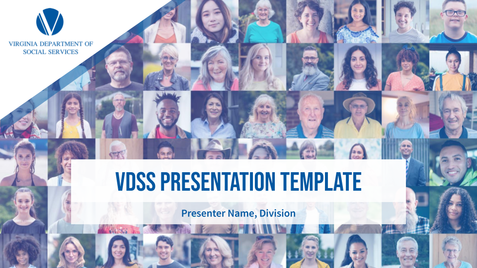 VDSS Presentation Template
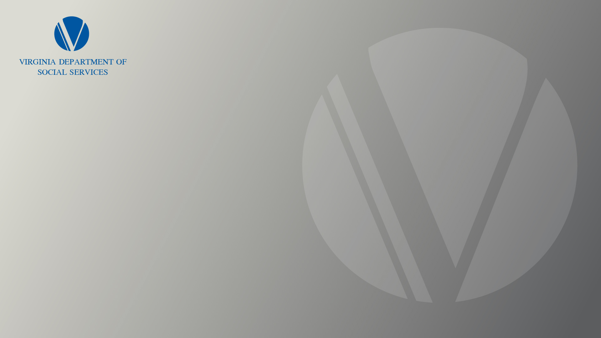
Virtual Backgrounds
The following background images are approved to be used during virtual meeting backgrounds.
To download a background image, click on the one you'd like below. Upon clicking on the image, it will open in a new tab. Once the image has opened in a new tab, right click the image and select "Save image as..." to save it locally to your computer. View instructions here on how to set or change your Microsoft Teams background, as well as tips on troubleshooting any issues.


Contact
Have a question about the VDSS brand? Contact us at public.affairs@dss.virginia.gov.